Crafting Meaning Behind Every Layer
Ben Sollee Concert Poster
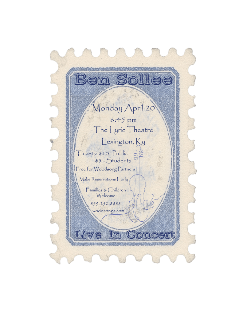
The goal of this poster was to create a visual piece that resonates with the soulful, roots-inspired music of Ben Sollee. I aimed to reflect the traditional and heartfelt nature of his sound while honoring his Kentucky heritage and classical influences.
The design process began with listening closely to Ben’s music and researching his background and biography. This helped shape a deeper understanding of his artistic identity. From there, I developed several mockups that leaned into vintage Americana aesthetics, drawing inspiration from postage stamps and old concert handbills to reflect the timelessness of his work.
This final piece was created using Adobe Illustrator, leveraging a variety of its tools to craft a distinctive, stamp-style poster with ornate details and hand-drawn elements. The result is a unique blend of visual nostalgia and modern design, inviting families and fans to an evening of live music that feels both intimate and enduring.
CC Pours
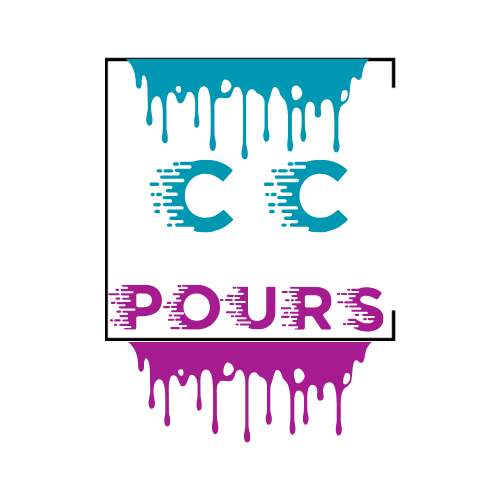
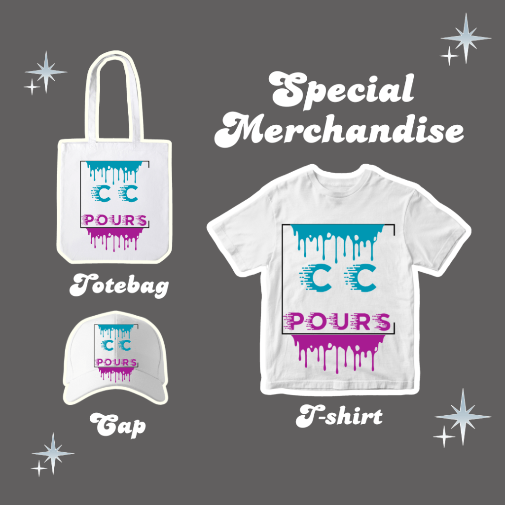
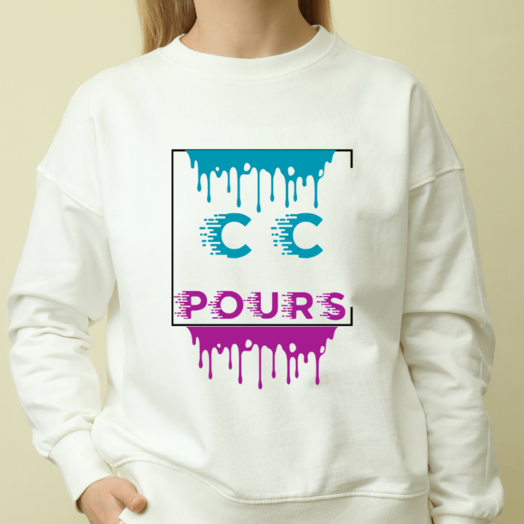
The goal of this project was to create a dynamic logo that visually reflects the essence of CC Pours — an art brand rooted in the fluid, layered beauty of resin pouring. I wanted the design to embody the way resin flows to form unique, mesmerizing pieces of art, while also delivering a bold, modern identity for the brand.
The process began with researching CC Pours and gaining a deeper understanding of their artistic approach and brand values. Inspired by the movement and texture of poured resin, I crafted a custom font and drip effects using Adobe Illustrator, experimenting with color and shape to simulate the layered, glossy aesthetic of resin. The result is a vibrant, eye-catching logo that communicates creativity and craftsmanship.
Using Illustrator’s extensive design tools, I brought together color, texture, and typography to complete a cohesive and memorable brand mark. The final outcome not only captured the artistic spirit of CC Pours but also contributed to tangible business success — following the launch of the new logo, CC Pours saw a 60% increase in sales of their artwork and merchandise.
Clay County Public Library Logo
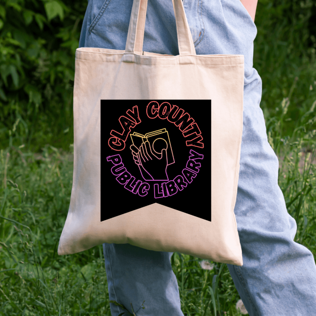
The objective of this project was to modernize and refresh the visual identity of the Clay County Public Library while honoring the legacy and traditional values reflected in their original logo. The goal was to create a design that felt both inviting and relevant, with a strong visual appeal to younger and more diverse audiences.
The design process began with in-depth conversations with the library staff to understand their vision and aspirations for a new logo. I also conducted research into the library’s branding history and the role it plays in the community. Using these insights, I developed a design that features a clean, symbolic illustration of a hand holding a book, framed by bold typography. The colorful gradient palette and textured lettering bring energy and warmth to the design, symbolizing learning, growth, and accessibility.
The logo was created entirely in Adobe Illustrator, where I utilized a wide range of tools to achieve the detailed line work, custom typography, and dynamic color transitions. The result is a vibrant, modern, and inclusive logo that still pays homage to the institution’s legacy.
Following its launch, the library reported a 45% increase in engagement from their targeted demographic, particularly among youth and young families—a clear indicator of the logo’s impact and relevance.
Wine Night Promo
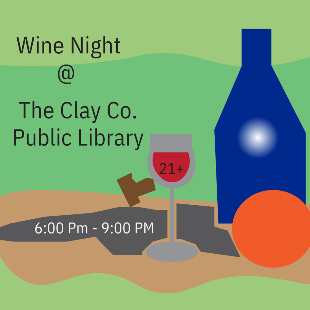
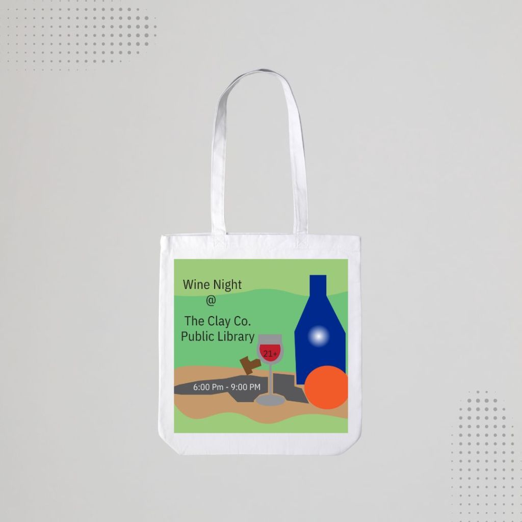
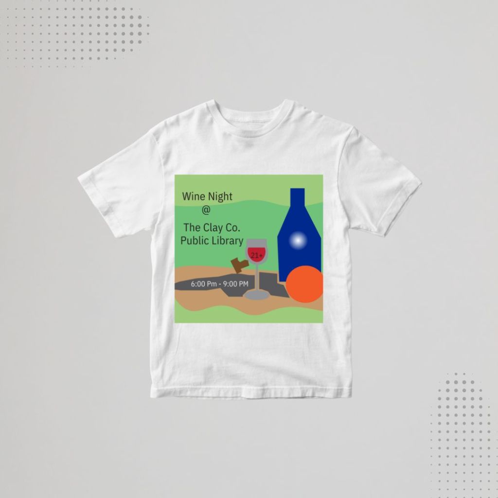
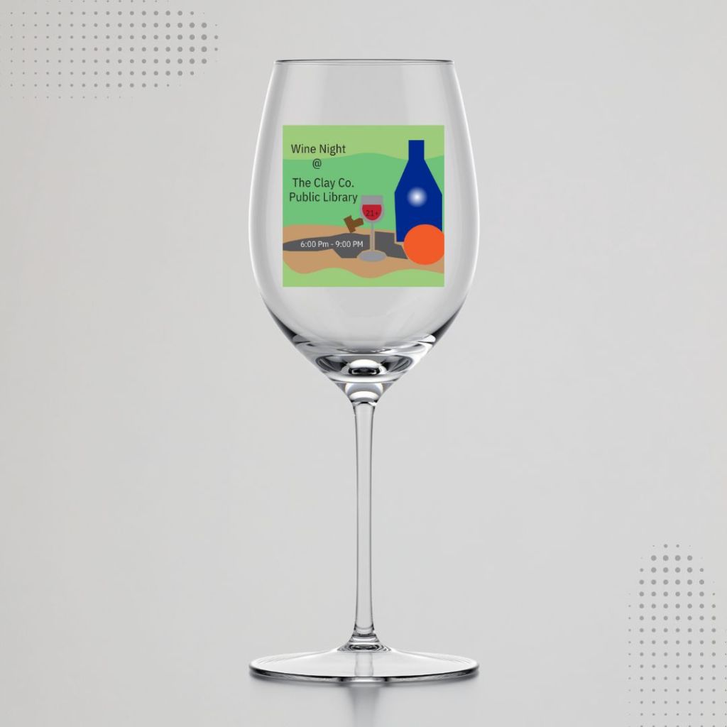
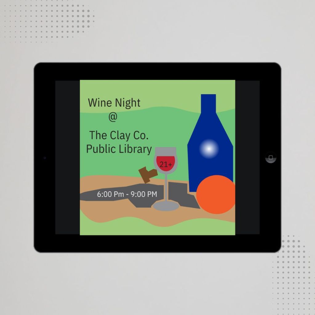
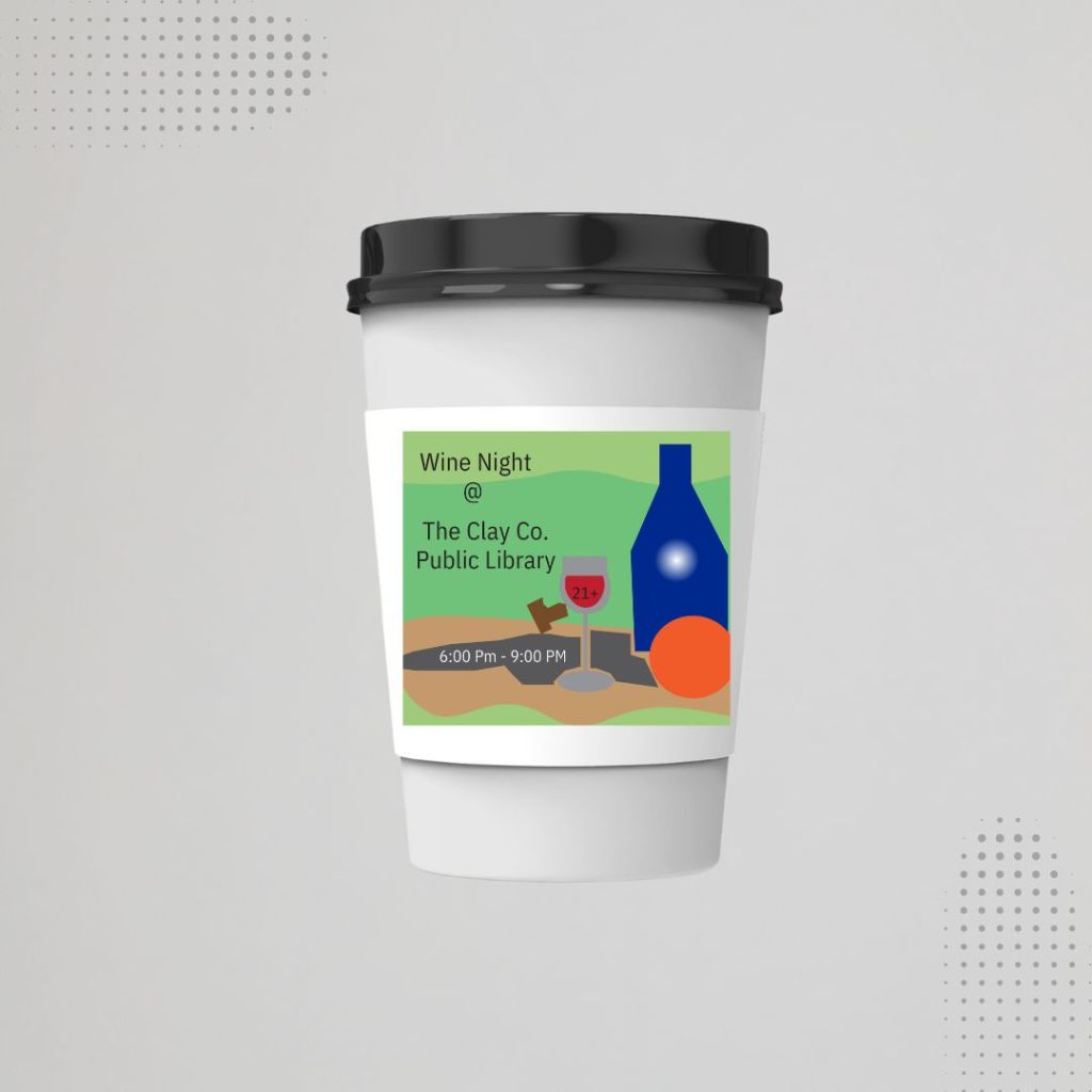
For the Clay County Public Library’s Wine Night, I designed a promotional graphic with the goal of creating something visually appealing while also conveying a sense of class and elegance. To ensure the design aligned with the library’s vision, I began by asking detailed questions about what they hoped to achieve with the promotion and who they wanted to reach. It became clear that the primary target demographic was middle-aged adults, and the design needed to reflect a sophisticated, welcoming atmosphere. This insight guided the tone, color palette, and overall composition of the piece.
Using Adobe Illustrator, I crafted the final artwork by combining clean vector elements and symbolic imagery, such as wine, a cork, and a bottle, to capture the theme of the event. The design was both modern and tasteful, aiming to attract attention while remaining professional. The outcome exceeded expectations—Wine Night had the highest attendance since the event began two years prior. The library staff was extremely pleased with the turnout and credited the success in part to the promotional material, highlighting its effectiveness in engaging the right audience.
Read 20 Minutes A Day Campaign
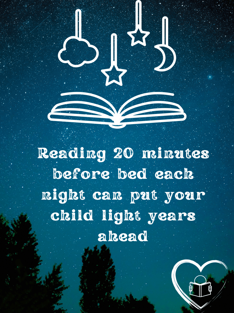

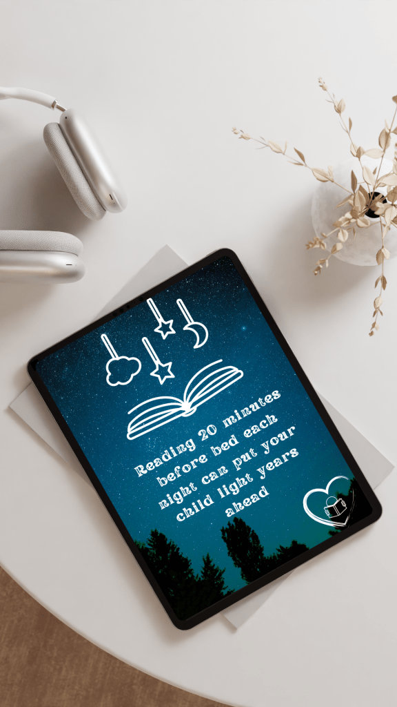
For the Clay County Public Library’s “Read 20 Minutes a Day With Your Child” campaign, I designed a visually engaging promotional poster aimed at parents of all age ranges. The goal was to create an eye-catching, easy-to-understand flyer that emphasized the importance of nightly reading. I used a night sky background combined with book and bedtime-themed vector imagery to subtly suggest that reading before bed is an ideal time to fit in those valuable 20 minutes. The clean, whimsical design reinforces the campaign’s message in a way that feels both inspiring and approachable.
The design process began with researching the goals of the campaign and understanding the library’s target audience. Using Adobe Photoshop and Adobe Illustrator, I crafted a balanced visual composition that tied together soft imagery with a bold message. The outcome was highly successful: the library reported a significant increase in both community engagement and interaction on their social media platforms. Compared to previous attempts, this campaign launch generated much stronger participation and awareness, helping the message reach a wider audience than ever before.
Shelf Life Magazine
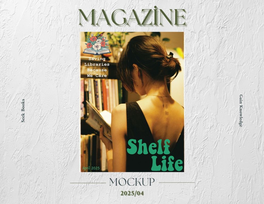
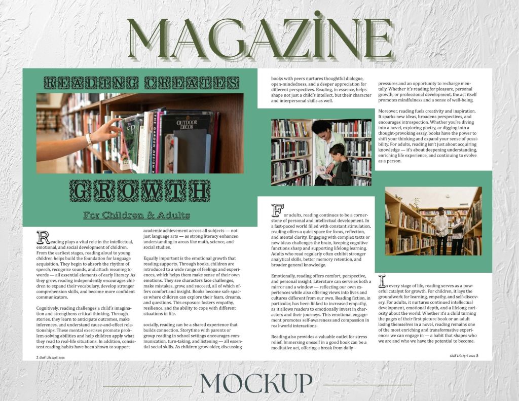
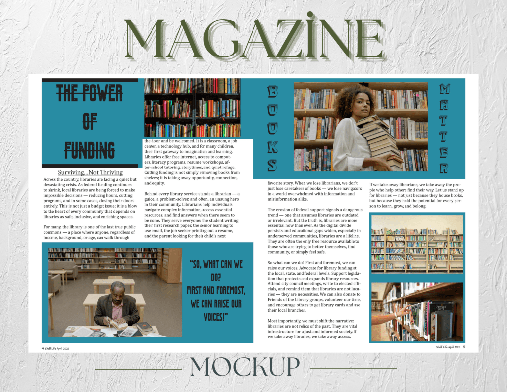
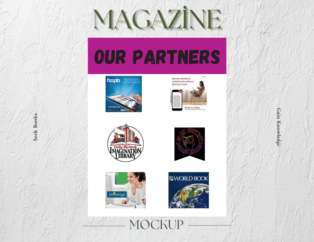

Shelf Life Magazine was developed as a passion project aimed at readers and advocates of public libraries, with the goal of raising awareness about the vital role libraries play in communities. Designed to be both informative and visually engaging, the magazine explores topics such as the impact of reading on personal development and the urgent need for sustainable library funding. From the cover to the editorial layout, every element was crafted to underscore the idea that libraries are not just repositories of books, but lifelines for learning, connection, and opportunity.
The design process began with thorough research into the state of public libraries—their funding challenges, community programs, and broader societal impact. Using Adobe InDesign to structure the magazine and Adobe Photoshop to enhance imagery and visual components, I created a polished and cohesive publication. The result is a magazine that not only informs but inspires, encouraging readers to advocate for libraries and recognize their value in today’s fast-paced, digital world. Shelf Life serves as both a love letter to libraries and a call to action to preserve them.
“Only What We Want To See” Novel Cover
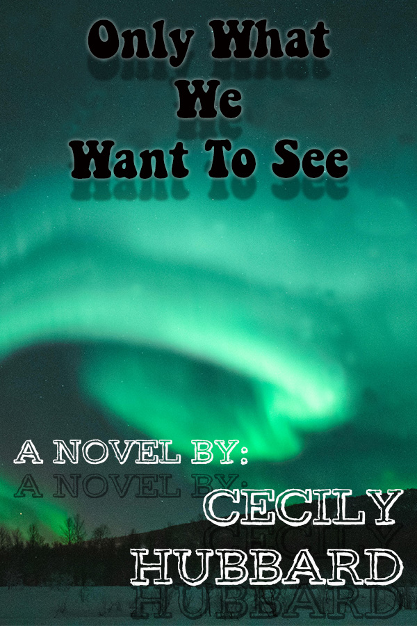
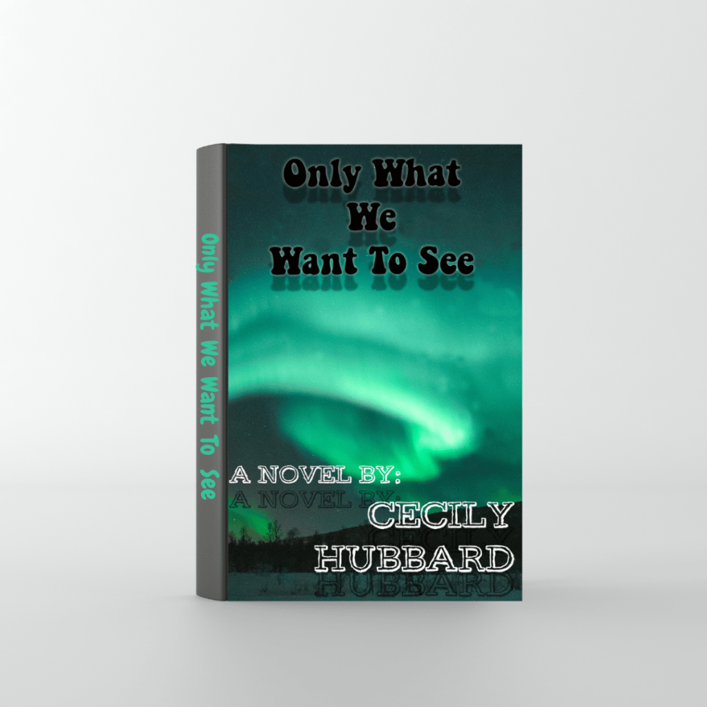
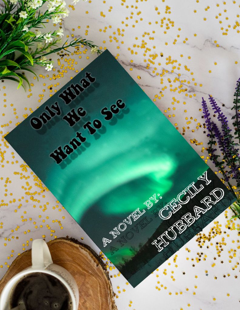
For the cover of my debut novel, I set out to create a design that was both beautiful and mysterious—reflecting the tone and themes of the story. The narrative follows a scientist studying the Aurora Borealis who stumbles upon a life-altering secret hidden within her company’s data. To capture that sense of wonder and intrigue, I made the aurora the focal point of the cover, using color, light, and atmosphere to evoke a sense of scientific awe and hidden danger.
The design process began with detailed research into the Aurora Borealis, including its appearance, movement, and the geographic regions where it occurs. Drawing inspiration from the novel’s plot and emotional core, I created the cover using Adobe Photoshop, focusing on blending ethereal light with moody, natural landscapes. The final result is a striking and thematically rich cover that invites readers into the mystery before they even turn the first page.
